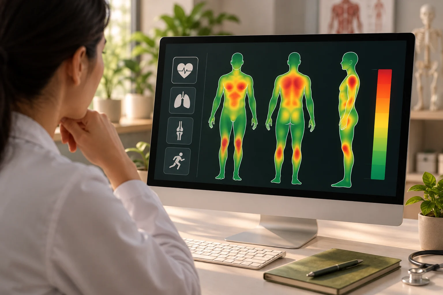
A Heat Map is a visual representation that uses variations in color or intensity to show the distribution or concentration of data across an area or dataset. In health monitoring, it can display patterns in measurements such as heart rate, activity, sleep quality, symptoms, or other health indicators over time. Each color level represents a particular range or value, helping users recognize differences quickly.
Heat Maps are commonly used in healthcare dashboards, medical research, fitness applications, and data analysis systems. Their purpose is to simplify complex datasets and make important patterns easier to identify. By highlighting higher or lower activity, risk, or measurement values, Heat Maps can support trend analysis, comparisons, identification of unusual patterns, and informed decision-making.